I've done a bit of a preliminary test today.
I have a set of mdf corridor/room sections from a friend. I have for a long time discounted them for this project, as the sizes he chose didn't match what I had in mind for WHQ.
Today I decided to give them a new look. After all, seeing how WHQ measurement is square based, relative positions are more important than getting the measurements to line up, I reasoned.
I also thought about how to manage the different ways WHQ corridors and such can match up. What originally stumped me was how to deal with the various possible positions corridors can link up, in a visually pleasing fashion. I was stuck on the idea of needing swappable pieces in the walls itself to account for the fact that one end of a corridor can have an exit in three possible locations.
But looking purely at relative positions and letting go of the notion of reproducing the WHQ board sections one-for-one, I realised that the three possible configurations for a WHQ corridor boil down to it being, in essence, a short corridor with either an extra straight bit or a corner tacked onto the end. Likewise I could also chop up the other WHQ sections into their constituent parts...
Which could give me the ability to match the WHQ board sections, and keep maximal flexibility for non-WHQ dungeoneering, AND, maybe, find a use for my friend's terrain sections.
But first, some measuring and testing was in order:
40mm squares, superimposed on the already existing terrain units. These two sections would be a single WHQ corridor.
As you can see the squares don't center or line up properly, there is a fair bit of dead space around them.
I'm a bit worried by the lack of room in the corner section and the width of the corridor to add much detail.
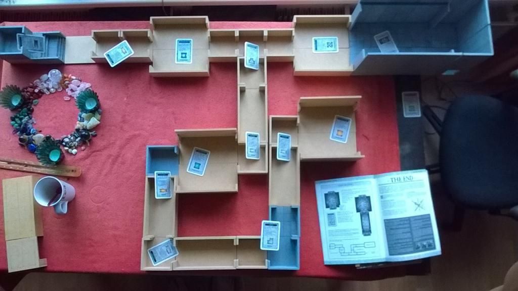
And a larger test: I prepared a WHQ exploration deck, as described in the rules, and set to. I didn't actually play the whole game, just the exploration phases. It was only afterwards that I concluded it would have been a good idea to also place miniatures, to get a feel for scale and proportions. :(
Anyway, here is what the completed dungeon looked like:
(I left the cards in centre of the corresponding group of dungeon sections, to give an idea of what is what. Hopefully, they'll also give something of an idea of scale.)
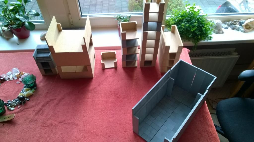
And all the parts I used, placed into stacks:
In this test I used any suitable piece I could find, or combine. To make a proper WHQ suitable set, I'd need to build a number of additional segments. Including ALL of the rooms and objective rooms, which I would have to have fresh MDF sawn for. Plus the sheer amount of surface/segments I would need to detail is somewhat intimidating...
So, I'd like to have some input before I decide yea or nae on this approach:
What do you folks think about this?


My word, that's all taking shape, well done Sir.
BeantwoordenVerwijderenThank you, Michael!
VerwijderenAs it is looking now, I guess actually building the dungeon is going to be the "Big Project"of 2015.